
We’re releasing a redesigned dashboard and believe us, we did our best to make it as efficient as possible. We got as much out of the old design as we were going to get. That’s why we decided to take a step back and evaluate how it works for our users.
We had a clear focus on fixing the evaluation space and then it just went on: brand new Calendar, shiny Past Events section and pretty Latest Registrations appeared. All that you've ever dreamed of in one place. So, let’s take a tour around the design highlights of the new trainer dashboard.
Our motivation
All we ever wanted is to provide WSB’s users with a calm, intuitive, and efficient working environment. We help our users to be more productive by delivering a neatly arranged product that makes sense. The less effort it takes to achieve something, the more you can focus on what you’re doing. We tried to present all data in the dashboard in a clear, easy to navigate way.
Calendar
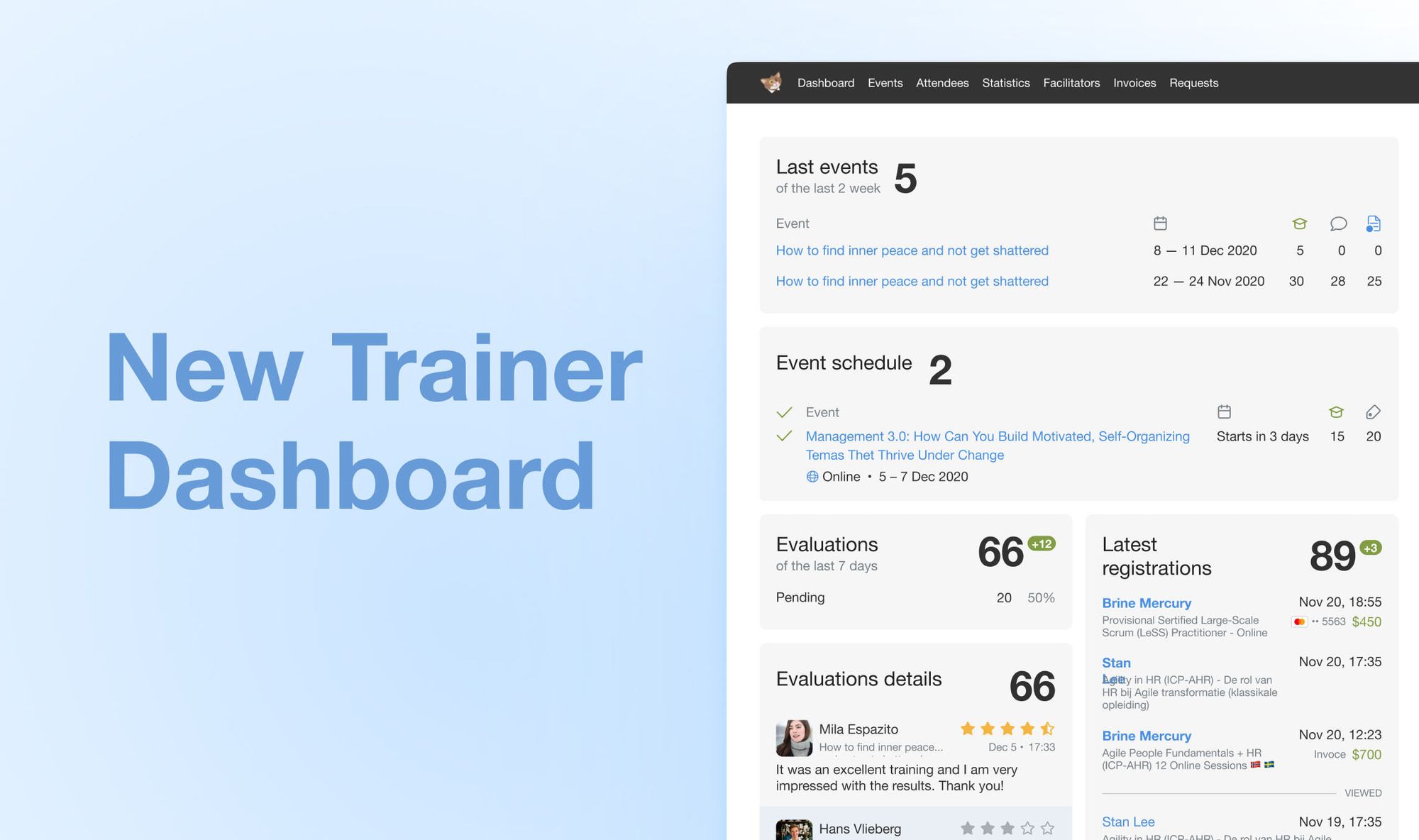
This is a first section one gets to entering the dashboard. Here you can see how many people have registered for the event and how many tickets were sold. That’s it! Plain and simple.
This card looked different during our first iteration, but we incorporated the feedback from Philipp Engslter in order to improve the look.
You can also influence how the new features look like by following us on LinkedIn and giving your feedback on our videos.

Past Events
From here you can proceed to the event pages and see all the important information like dates, amount of students, number of certificates and feedback received. Looks good, isn't it?

Evaluations
The list of approved and pending evaluations sorted from Newest to Oldest. Click the “Approve” button to confirm feedback receiving and sending certificate out. This section is full of golden stars and positive energy!

Latest Registrations
Something else we think will help: the list of recently registered students with quick access to the student's profile right in front of your eyes.

Next Up
We’ll continue to fine-tune the dashboard and our other features. We’re also working on a new approach to the feedback collection and some other interesting and useful stuff, but we’ll let you know about those when they’re ready.
Meanwhile, it won’t hurt to watch a loom video about our brilliant dashboard made by the one and only Sergey Kotlov.
Do get in touch and let us know what you think of the new dashboard!