Your website is the representation of your business that should attract customers from the first sight. And we believe that eye-pleasing design and carefully organized information are the best bet to do it.
That’s the two factors we took into consideration when reworking our WordPress templates. The data displayed there is the same but now it’s positioned differently — more compactly and easier to navigate.
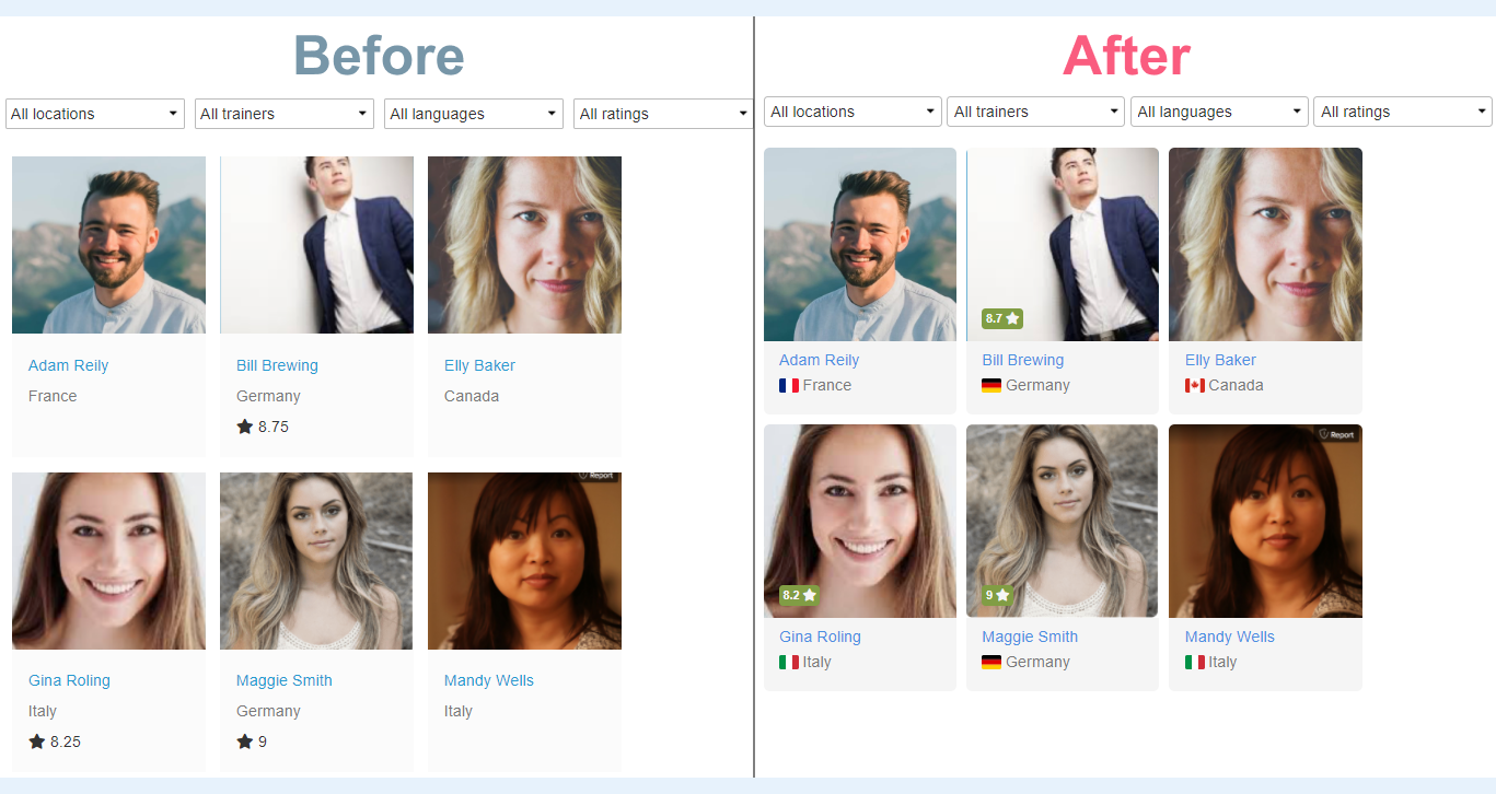
Don't just take our word for it. See the comparison of old and new templates and the list of changes for each template below.
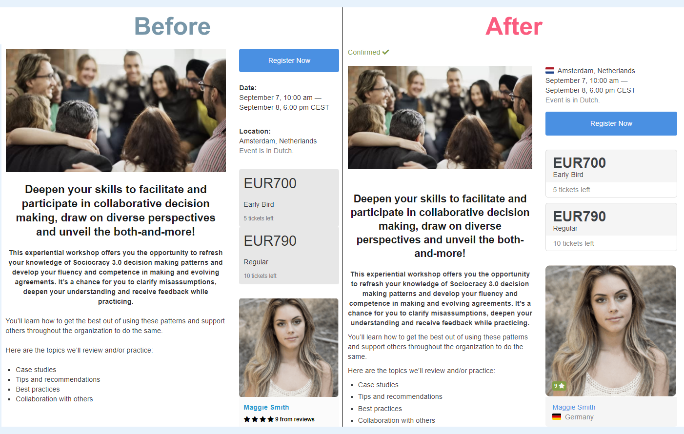
Event details
- Country flags are added for a location and a trainer
- Each ticket type is in a separate slot
- Star rating stands out better
- "Confirmed" mark is shown
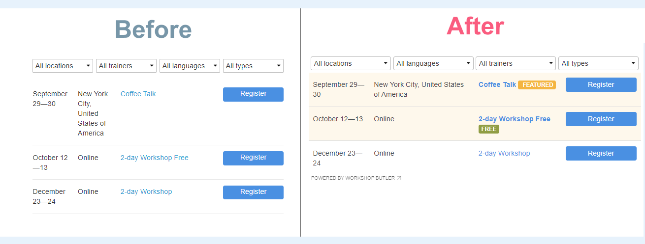
Schedule
- Information is positioned better
- Featured and Free events have special labels and background
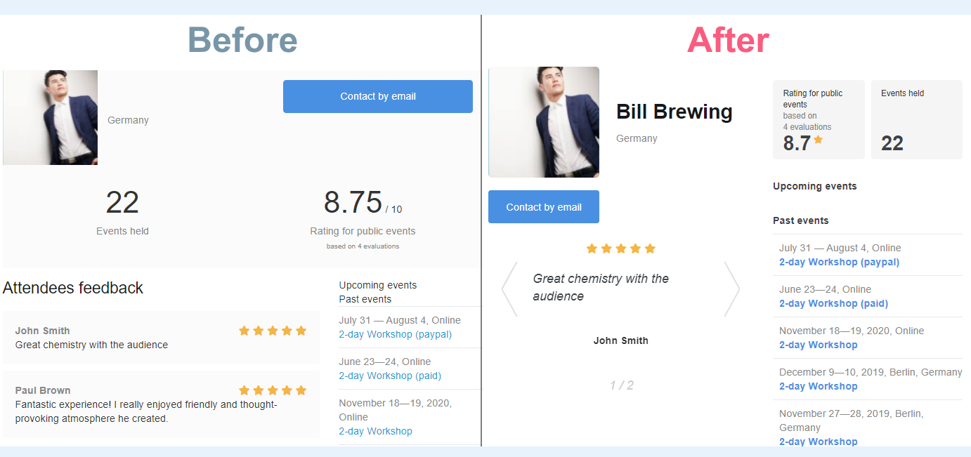
Trainer's profile
- Statistics (star rating, number of evaluations, and number of events held) is compiled in one place
- Visitors can scroll through testimonials organized into carousel sliders
- Trainer's name is located next to a photo where it's easier to spot
- The font is easier to read
List of trainers
- Country flag is shown
- Star rating stands out better
The migration will take just a couple of clicks and you will be able to switch between old and new templates before your complete the migration.
To switch your website to new templates please follow this guide.

